Carbon Data, Redesigned
Emitwise v1 wasn't really a product — it was a service with a product front-end. Every time a customer needed to analyse their carbon data, an engineer had to get involved. That was the ceiling. To grow, we needed to redesign what the product fundamentally did.
The Context
A product that worked — just not at scale.
When I joined Emitwise, v1 was in production and working. But every analysis required an engineer to process the data manually. The product was a front-end for a human workflow, not an autonomous system.
The Challenge
Engineering time was the product's biggest bottleneck.
We ran 10 interviews across two groups: engineers doing the manual work, and carbon accountants translating it into customer value. We mapped the full data journey from customer file to carbon report — and the map made the structural problem undeniable: engineering time was consumed by work the product itself should handle.
Onboarding & setup
Customer provides data
Clean & standardise
Ingest & process
Classify & scope
Review classification
QA / QC → Publish
Scoping, contract & alignment
Pre-work before any data moves
Gather & send data
Dependency on the customer
6 weeksClean & standardise files
Manual, per file
1h / fileProcess & run pipeline
Hand-run each time
up to 6hManual classification & scope
Line-by-line assignment
~2 min eaReview classification
Check scope & mapping
QA on platform → publish
Final check, then live
~4hThe ceiling
Every customer analysis ran through an engineer — **up to 6h plus 1h per file** of manual work the product itself should handle. That was the ceiling on growth.
The reframe
We stopped asking "how do we display this data?" and started asking "what question is the user trying to answer right now?" That shift changed every design decision that followed.
User flow — Dashboard & Visualisation creation
New or existing dashboard?
Name & set up dashboard
Open dashboard
Add visualisation
Choose chart type
Select data & dimensions
Apply filters
Preview OK?
Visualisation action?
Save visualisation
Update visualisation
Add more?
Dashboard action?
Save dashboard
Update dashboard
User flow — Target creation
Select emission scope
Which scope?
Direct & energy emissions
Value chain categories
Set SBTi ambition level
Ambition level?
Below 2°C
~4.2% annual reduction
1.5°C aligned
~4.2% reduction + removals
Set target year
Input growth rate assumptions
Target valid?
Review target summary
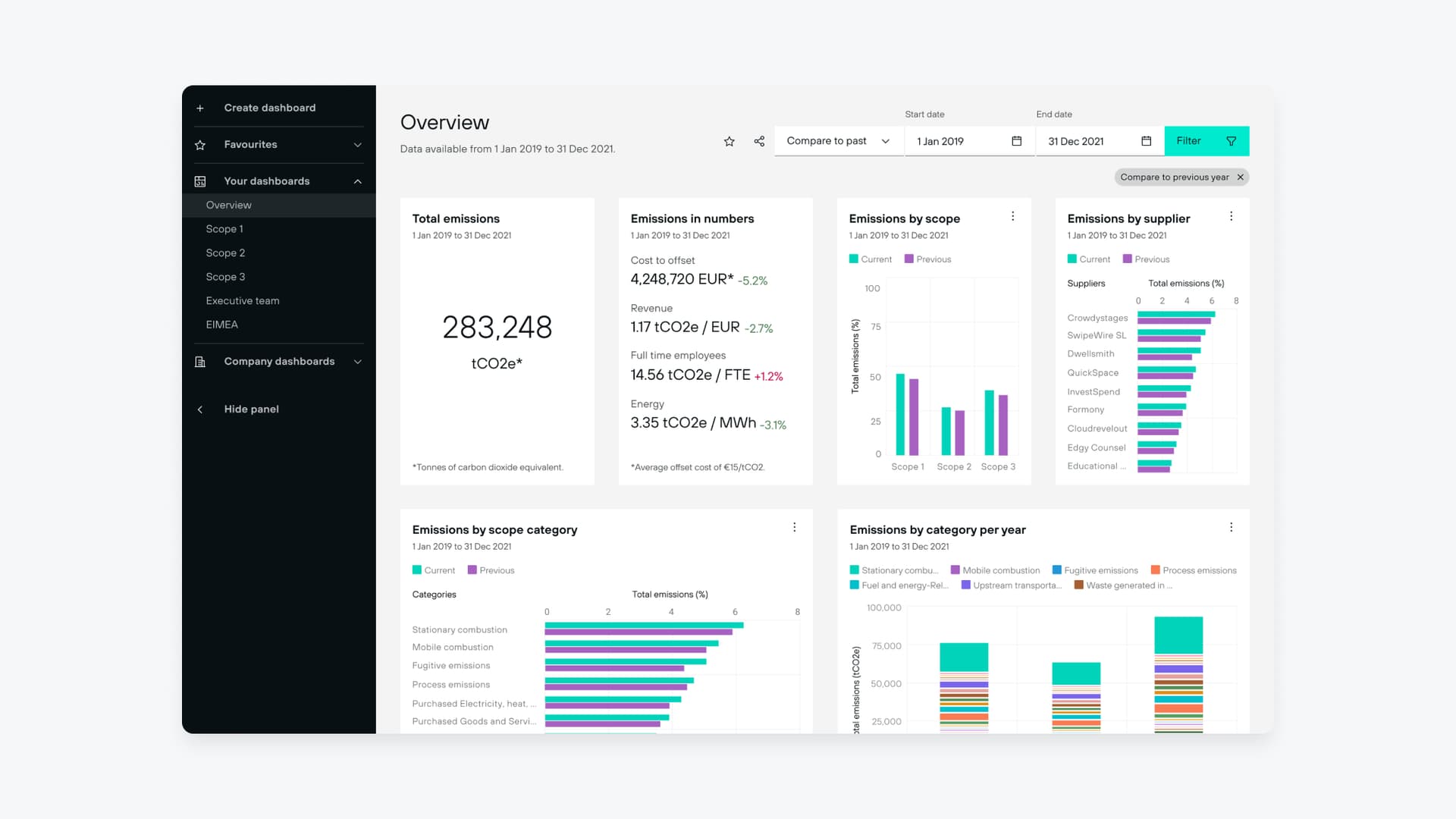
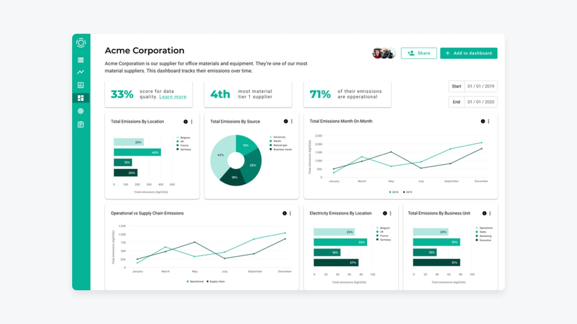
The Solution
Redesigned around user questions, not data structure.
We started from first principles rather than patching v1. Customer interviews produced not a feature list, but a set of recurring questions: What are my biggest sources? Am I on track for my target? Which supplier is the outlier? Those questions became the spine of every dashboard and chart in v2.
Delivering at three speeds
To ship without constant blocking, we ran three workstreams simultaneously through Dual Track delivery — parallel streams with deliberate handoff points rather than sequential queues. It worked when synchronisation was tight, and proved that non-linear delivery lives or dies on coordination quality, not the model itself.
The Outcome
Engineers out of the pipeline. Customers in control.
Emitwise went from a service that scaled with headcount to a product that scaled with usage. Every chart traces back to a specific question users need to answer — reducing cognitive load and making emissions data immediately actionable.
Learnings
Six lessons from 18 months of rebuilding a product from scratch.
Performance is a design decision
It doesn't matter if you have to change the framework or swap UI libraries. Performance improvements are UX improvements. Don't treat them as an engineering concern alone.
There is no good time for feedback
Iterate on how you ask for it. A scheduled session, a Loom, a quick sync then async space — different audiences need different formats. Find what works for each person, not one process that works for none.
Deadlines bring ownership
Estimate your work, pick a date you feel confident about, and commit to it. Deadlines aren't constraints — they're the mechanism that makes teams accountable to each other. Without them, foundational work stretches indefinitely.
Data visualisation is genuinely hard
A year designing dashboards forced me to question everything I thought I knew about charting. Data overload, chart behaviour at scale, edge cases — most guidelines only scratch the surface. Go deeper. Read the specialist literature.
Be willing to experiment with how you work, not just what you build
The Dual Track taught us that non-linear delivery lives or dies on coordination quality, not the model itself. When it worked, output accelerated significantly. When it didn't, we adjusted. If your team can sustain it, it's worth trying.