

Introduction
One of the last projects of the year 2019 was the rebranding of Forward. It was a tough project because we all loved this name, but there is another company with the same name in the same sector in the United States so in terms of international expansion was going to be a problem in the near future.
We decided to find a new name for the company and we started working very closely with the renowned branding studio Koto for it.
The naming was the first step on this process and after some meetings with them, Pando, the largest living organism on Earth, won over other appealing proposals.


Colour Palette

Typography
Brand Guidelines
Once we found our name again we worked with the studio on the branding guidelines. Colour palette, typography, logo, strategy framework,… everything should breathe like this giant tree.
After several meetings and dozens of nice proposals, we were very close to cross the line of fire when an agency is burned of the feedback and you want to find something else. It was much harder than finding a good name with a cool meaning.
Our company values, accessibility of the product and obviously the brand image we wanted to show were the key factors at the moment we decided to choose the multi-colour pivot point symbol where our clinicians and clinical teams connect.

Forward

Pando
App Rebranding
With the branding guidelines well defined, we started working on how to apply these changes into the product. We decided to keep the app as similar as possible changing only colours and illustrations. These would help our users to have the same workflows and elements they were used to see every day.
The first thing we did was the accessibility test with the new colours. We found that not all of them passed the test so we decided to add some secondary colours to help to improve the accessibility. Updating the colours let us enable features like Dark Mode and other accessibility tools.
The illustrations style was defined through a process of studying some brilliant illustrators we believed could represent our brand. Then, we found the right point between business and fun we wanted to have and we worked on a character study that it evolved on the illustrations we have today.
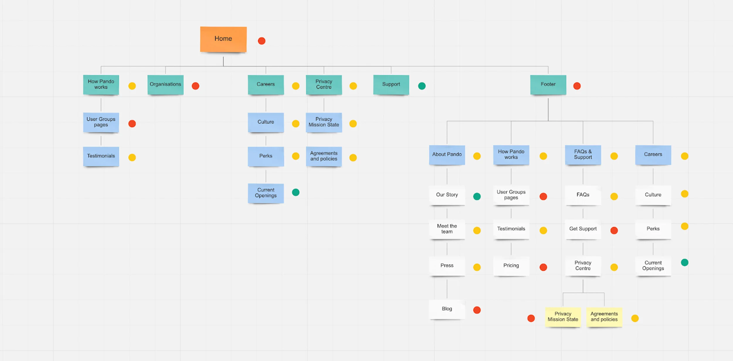
Pando’s sitemap
Pando’s website
Forward’s website needed an update and our main goal here was telling our users why Forward became Pando but also improve Forward’s website from a UX perspective and transform it into another living organism.
We analyzed our user’s visits pages, sitemap, flows and we listened to other companies rebranding feedback to learn from them and be prepared for what it was coming.
The new website of Pando was, in my opinion, the hardest part of the whole project. We had to create a new awesome website from scratch and we wanted to simplify all the process to allow the users to find everything without any problem.
As I said before we started from scratch painting low-fidelity wireframes of the main pages, defining every section and thinking about the different user flows that could appear.
We followed the whole process of the wireframes adding more content and placeholders in the mid-fidelity version and finally adding all the design elements and copies in the high-fidelity. Doing this gave us the ability to transform the website into its responsive versions without any problem.

Low-fidelity wireframes

Mid-fidelity wireframes

Learnings from this rebranding
After we finished the rebranding and the feedback phase ended we could consider doing a rebranding per year because overall the transition was super smooth! These are some learning from this project that could save you time and money next time:
Consistent feedback: sometimes you want to find something really cool for your brand but changing your opinion is not going to make it appear. Keep your initial thoughts and work over and over them. You will see the light at the right moment.
Work collaboratively: the success of this rebranding resides in the fact that we worked as a team. Each person of the team took ownership of different parts of the project and then we assembled all this part using team collaboration tools like Figma, Jira or Trello.
A company website is always evolving: there are always things nice to have but leave them to a second phase could be a key factor in the success of the project.
Negative Backlash: some users will be stuck with the name & story and they will give you negative feedback.
Saturation of Social Media channels: communicate to all users on all channels, but you should expect to take some time until every user notices.
Give it time: despite all efforts, it will take time until the last existing knows about the change or gets used to the new name.

P.S. This is my favourite illustration from the great designer and better person Aaron Williams. It represents Pando, the largest living organism on Earth.